YouTube Announces a set of New Updates
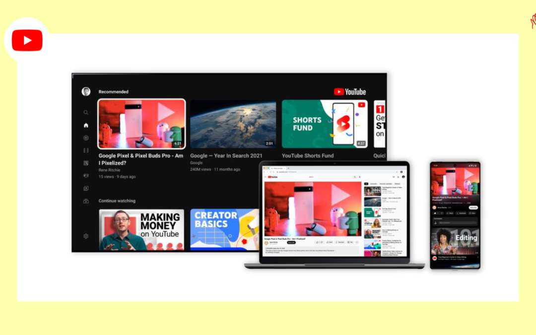
To make the platform more user-friendly, YouTube has announced a set of new updates.
Firstly, the most friendly one is the new ‘Pinch to Zoom’ that provide users with the ability to actually zoom in and expand the screen size in case they want to get a closer look at the details of the video they’re watching.
“If you are watching a lecture, and you can’t exactly see what’s written on the whiteboard… ZOOM”
Additionally, YouTube is also introducing more accurate searching in order to help users identify the specific time place in a video clip that they need to skip to.
“Have you ever followed along to a tutorial on your phone, but needed to keep rewinding, so you could master that one small step? Precise seeking helps solve this problem. Whether you’re on a desktop or your mobile device, simply drag or swipe up while seeking to display a row of thumbnails in the video player, and you’ll be able to make fine-tuned adjustments to get to the exact part in each video.”
This new feature will solve that!
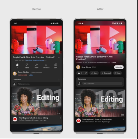
Along with some other visual presentation updates, YouTube is rolling out an ambient mode that offers a better and more aesthetic watching experience.

The purpose behind this update is to attract visitors into the material and make the video even more prominent on the Watch Page.
With the introduction of a darker ‘Dark Mode’, to make colors appear more bright on the channel, YouTube has made some more changes.
Intending to reduce distractions during watching, YouTube has also planned to update the ‘Like’, ‘Share’, ‘Download’, and ‘Subscribe’ buttons and the links to them in the description box.
“The new shape and high contrast make it really stand out, and while it’s no longer red, it’s easier to find and way more accessible to everyone on both watch pages and channel pages.”
Not just that, it is also changing the color of hashtags from blue to white. Although this might make hashtags a little less notable, the functionality, however, remains the same.
Let’s see how is hashtag engagement impacted by this minor change.
In Conclusion
Most of these updates are not much significant, but the pinch to zoom is quite a handy one that I’m sure most of us really have had felt the need of.
It will however yet to observe how these modifications affect the in -app engagement, even though they are likely to have less of an effect on the functionality.


Recent Comments